Trends We Love (And Ones We're Skipping)
Our studio's short list of what still earns a place in high-end residential work — and what we are leaving behind.
Every January, the design press publishes trend forecasts. Some are genuinely useful observations about where materials and layouts are headed. Others are manufacturer-driven hype dressed up as editorial insight. We read them all and filter ruthlessly — because the homes we build need to feel right in ten years, not just ten months.
What we are keeping
- Fluted and reeded surfaces — vertical ribbing on cabinet fronts, island panels, and range hoods adds texture and shadow without pattern. It is subtle, tactile, and ages well.
- Warm metals mixed intentionally — unlacquered brass, aged bronze, and brushed gold layered in the same kitchen. The key is keeping the undertone consistent while varying the finish.
- Integrated appliances — refrigerator and dishwasher panels that match the cabinetry create visual calm in open-plan kitchens. The kitchen recedes into the architecture.
- Wet rooms — removing the shower curb and tiling the entire bathroom floor creates a seamless, spa-like space that also happens to be more accessible and easier to clean.
- Natural stone in unexpected places — marble or quartzite on a window sill, a shelf niche, or a bench seat. Small surface area, high impact, lower cost than a full countertop.
What these trends share is restraint. They add richness without volume. They make spaces feel considered rather than decorated. That is the common thread in everything we are drawn to right now.
"Trends are a starting point for conversation, not a script. The best homes still come from listening to the site and the people who live there."
What we are skipping
- Bold-colored cabinetry as a primary finish — a teal or terracotta island is exciting for the first year and exhausting by the third. We use color in places that are easy to change: paint, accessories, textiles.
- Oversized format tile on every surface — large-format porcelain has its place, but when it covers floors, walls, and shower ceilings, rooms lose scale and start to feel like commercial lobbies.
- Open shelving as the only upper storage — beautiful in photos, impractical in life. Dust, grease, and visual clutter accumulate fast. We use it sparingly, balanced with closed storage.
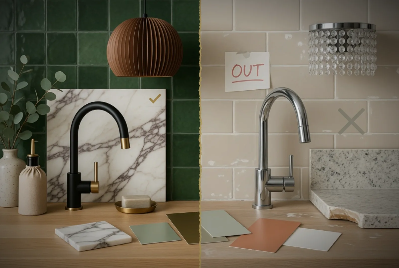
- Matte black everything — matte black fixtures were a welcome antidote to brushed nickel overload, but the trend has overcorrected. It shows water spots, fingerprints, and wear more than any other finish.
- Waterfall countertops on both sides of an island — one waterfall end is a clean detail. Both sides traps the eye and doubles the stone cost without doubling the impact.
Skipping a trend does not mean it is bad design. It means we do not think it serves the specific context of a long-lasting, high-use residential space. A matte black faucet in a powder room that gets used twice a day is fine. Matte black everything in a kitchen with three kids is a maintenance sentence.
The question we always ask
Before specifying anything driven by a current trend, we ask one question: will this still feel right when the trend passes? If the answer depends on the trend staying popular, we find a different solution. If the answer is yes regardless, we use it — not because it is trendy, but because it is good.
When evaluating a design trend for your own home, look at how it photographs versus how it lives. Open shelving photographs beautifully because it is styled for the shot. In daily life, it collects dust and requires constant curation. Always choose livability over aesthetics.
The best homes are not trend-proof — they are trend-aware. They borrow from the current conversation without being defined by it. That is the line we try to walk in every project.